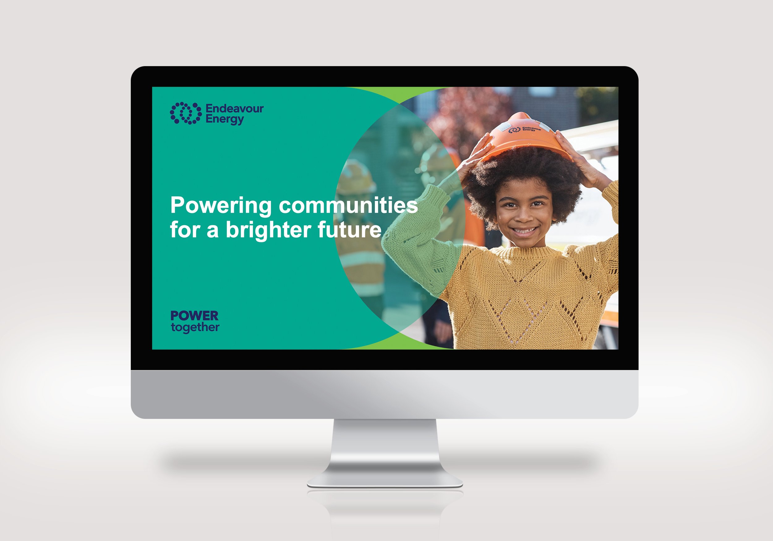
‘Power together’ defines a new way forward for Endeavour Energy
Endeavour Energy ensures the energy flows to millions of people in New South Wales every day of the year. In a rapidly transforming sector with many new opportunities, it was time for the company to lead with a more visible brand. Alongside our trusted partners, One Tribe Consulting, we developed a new brand, creating a more contemporary look that works strongly across all platforms.
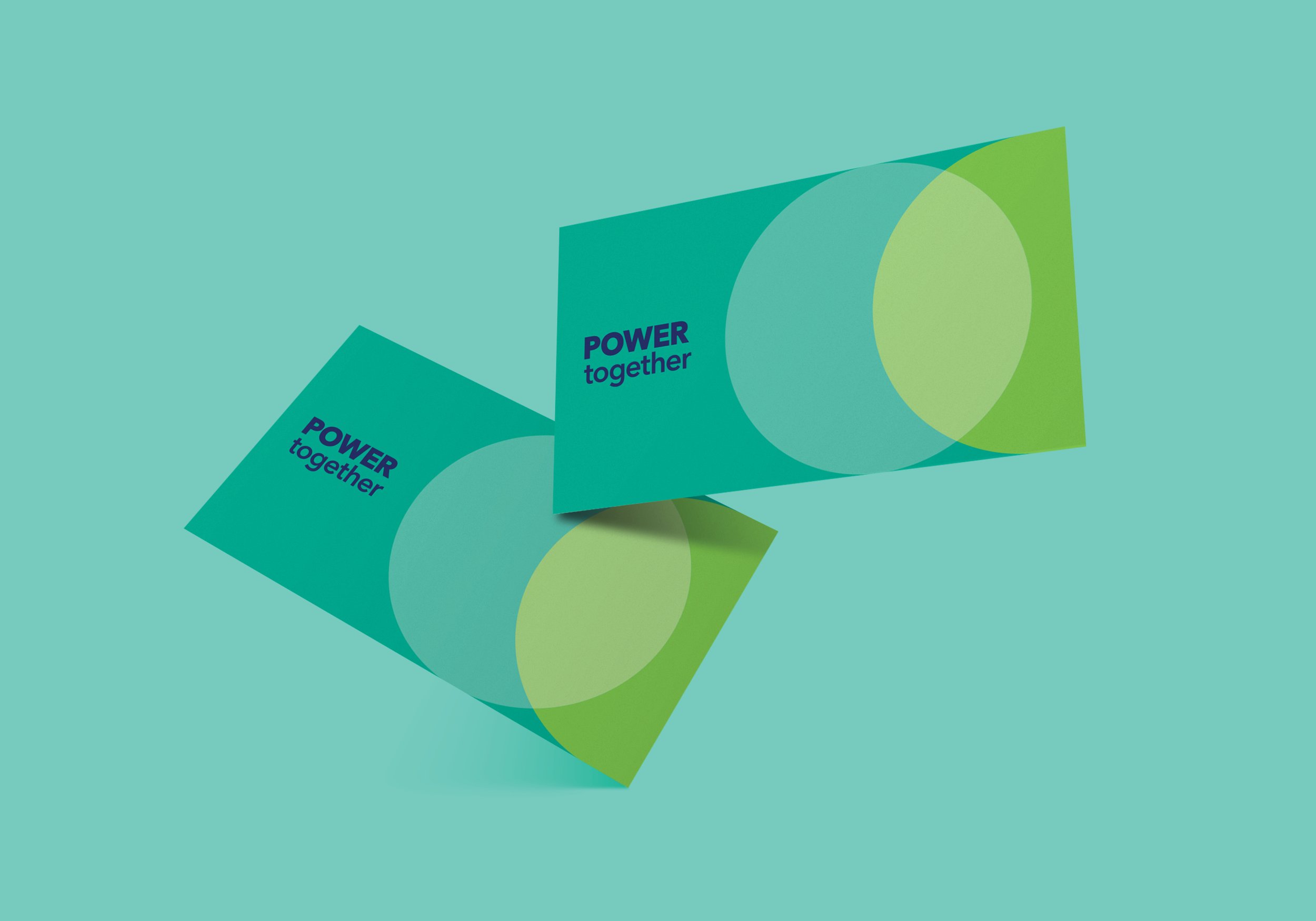
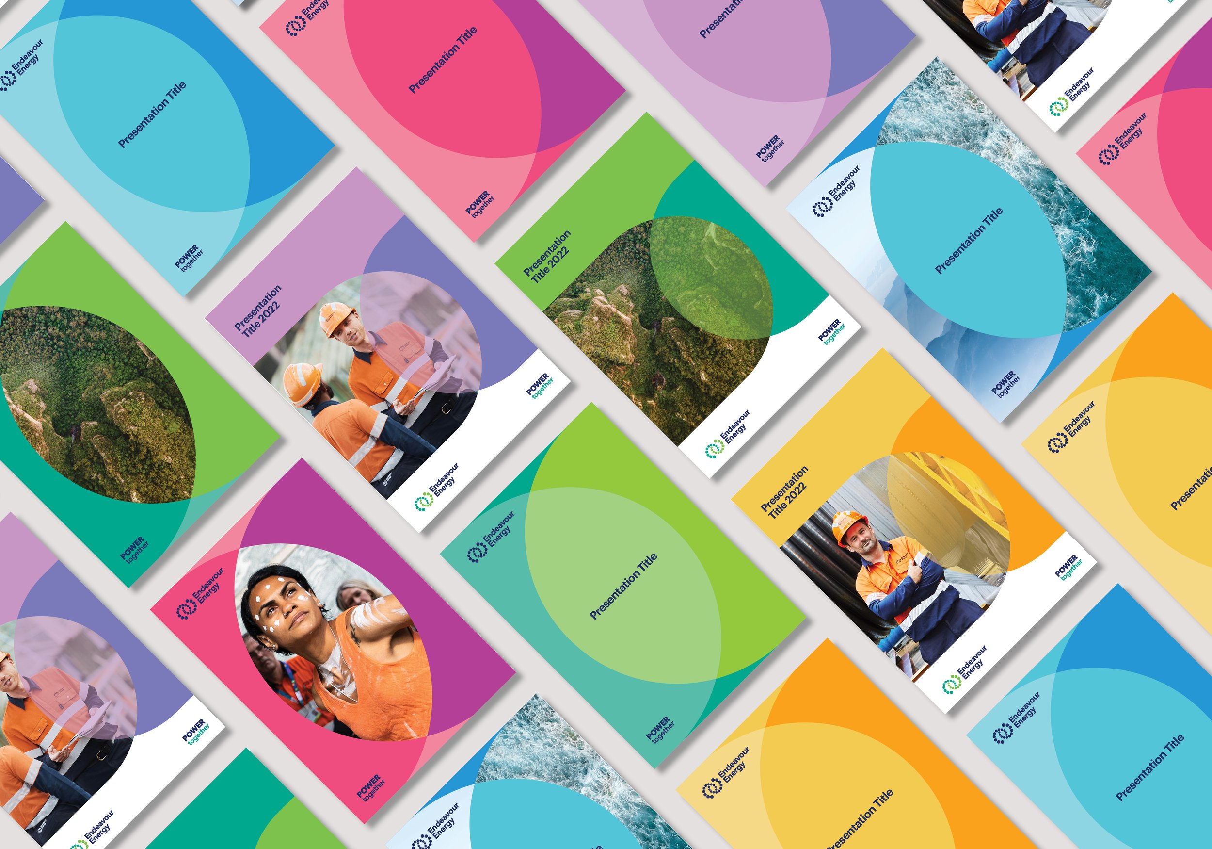
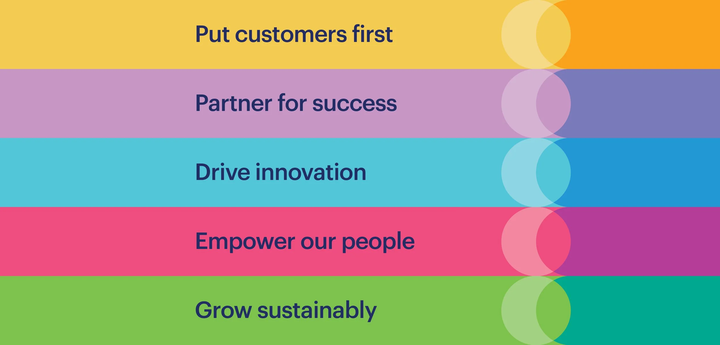
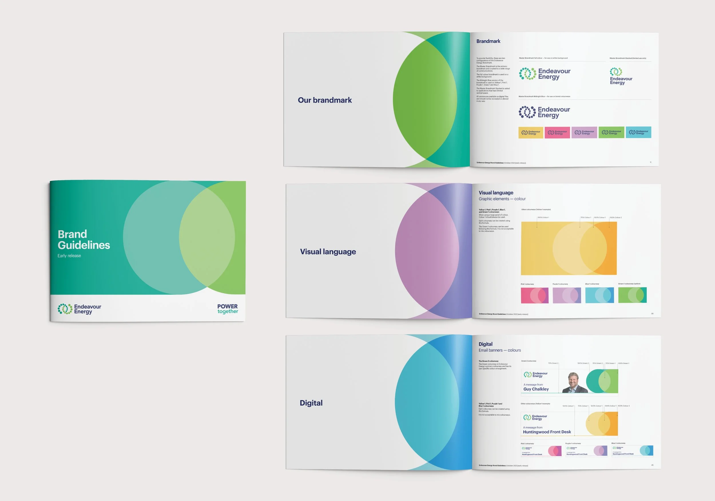
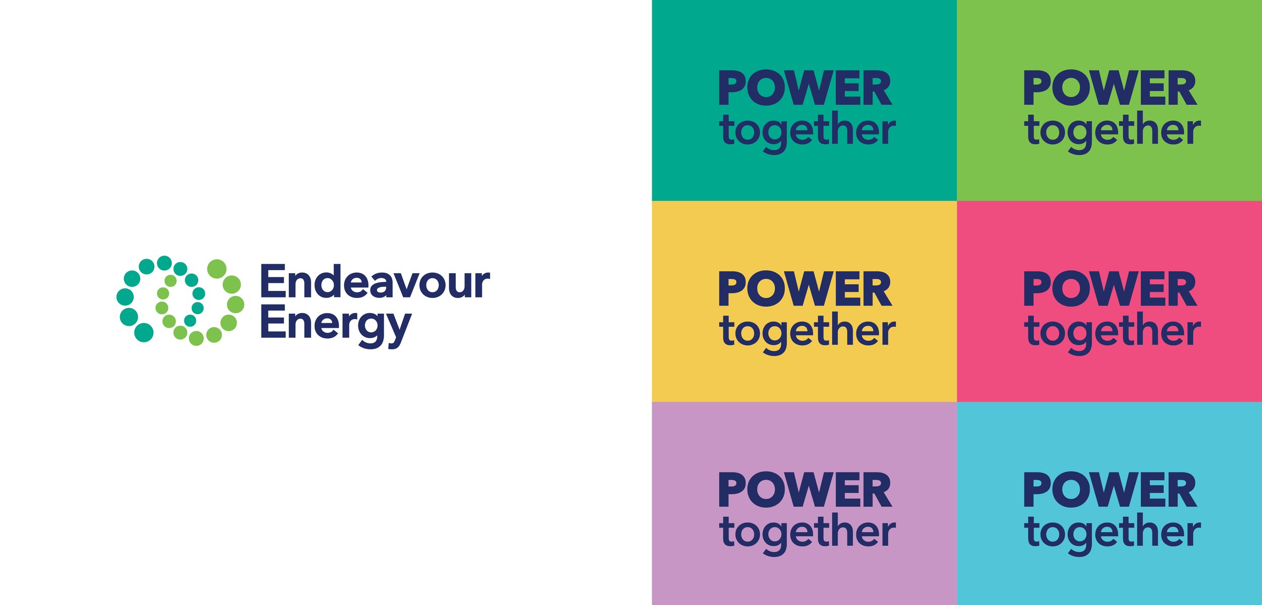
The two circles of the refreshed logo represent what happens when we ‘Power together’ with our customers, our communities and each other: we bring people and ideas together; we create new energy. The signature colour, green, is the colour of growth and represents a sustainable energy future, while the navy brings strength and clarity. The rest of the colour palette is fresh, contemporary and bold, aligning with the brand themes and allowing Endeavour Energy to stand out in different markets and with different audiences.
The end result is a compelling, confident new brand that has really powered the business for the future.
“One Tribe and Amanda Roach Design have been wonderful partners. Strategic, insightful and incredibly creative. Penny and her team were quick to understand the pulse of our business and able to pivot their approach to sync with employee feedback; while Amanda always brings her A-game, her work is incredibly polished and our new look speaks for itself. It’s been wonderful to watch how wholeheartedly our people have gotten behind our new brand positioning and to watch it come to life! One Tribe and Amanda Roach Design have really delivered.” Vida Cheeseman, Head of Corporate Communications, Endeavour Energy